Navigation article:
- Early Semitic writing
- Old Hebrew
- Spread of Aramaic to the Middle East and Asia
- Arabic calligraphy
- Indic calligraphy
- Greek handwriting
- Origins to the 8th century ce
- Ptolemaic period
- Roman period
- Byzantine period
- The 8th to 16th century
- Late uncial, 9th to 12th century
- Earliest minuscule, 8th to 10th century
- Formal minuscule, 10th to 14th century
- Personal hands, 12th to 14th century
- The Italian Renaissance
Calligraphy, the art of beautiful handwriting. The term may derive from the Greek words for “beauty” (kallos) and “to write” (graphein). It implies a sure knowledge of the correct form of letters—i.e., the conventional signs by which language can be communicated—and the skill to make them with such ordering of the various parts and harmony of proportions that the experienced, knowledgeable eye will recognize such composition as a work of art. Calligraphic work, as art, need not be legible in the usual sense of the word.
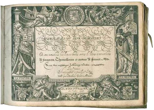
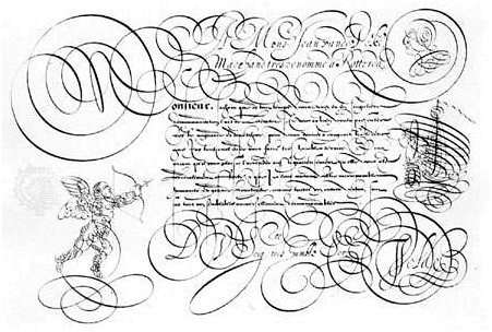
In the Middle East and East Asia, calligraphy by long and exacting tradition is considered a major art, equal to sculpture or painting. In Western culture the plainer Greek- and Latin-derived alphabets and the spread of literacy have tended to make handwriting in principle an art that anyone can practice. Nonetheless, after the introduction of printing in Europe in the mid-15th century, a clear distinction arose between handwriting and more elaborate forms of scripts and lettering. In fact, new words meaning “calligraphy” entered most European languages about the end of the 16th century, and in English the word calligraphy did not appear until 1613. Writing books from the 16th century through the present day have continued to distinguish between ordinary handwriting and the more decorative calligraphy.
It has often been assumed that the printing process ended the manuscript tradition. This is not quite true: for example, most of the surviving books of hours (lavish private devotional manuscript books) date from the period after the introduction of printing. Furthermore, certain types of publications, such as musical scores, scientific notation, and other specialized or small-audience works, continued to be handwritten well into the 19th century. Thus, although handwritten books could not be reproduced in quantity or with complete uniformity, they did survive the introduction of printing. Printing and handwriting began to influence each other: for example, modern advertising continues to incorporate calligraphy, and many calligraphers have through the years designed typefaces for printing.
Early Semitic writing
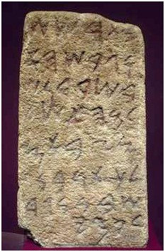
During the 2nd millennium bce , various Semitic peoples at the eastern end of the Mediterranean were experimenting with alphabetic writing. Between 1500 and 1000 bce , alphabetic signs found in scattered sites showed a correspondence of form and provided material for sound translations. Bodies of writing from this period are fragmented: a few signs scratched on sherds or cut in stone. Few of these are celebrated in terms of aesthetic value.
One interesting set of Semitic inscriptions was discovered in 1905 at an ancient mining site on the Sinai Peninsula. A sphinx from that discovery yields the taw, nun, taw, or t, n, t, meaning “gift.” It is evident that the nun, or n, sign is a rendering of a serpent. Most of the early Semitic alphabetic signs were similarly derived from word signs of more ancient vintage.
The several Semitic peoples in the Middle East area spoke languages that were closely related, and this enabled them to use the same set of alphabetic signs. After some experimentation the alphabet was reduced to 22 signs for consonants. There were no vowel signs. The tribes of Canaan (Hebrews, Phoenicians, and Aramaeans) were important in the development of alphabetic writing, and all seemed to be employing the alphabet by 1000 bce .
The Phoenicians, living along a 20-mile (30-kilometre) strip on the Mediterranean, made the great sea their second home, giving the alphabet to Greeks in the mutual trading area and leaving inscriptions in many sites. One of the finest Phoenician inscriptions exists on a bronze cup from Cyprus called the Baal of Lebanon (in the Louvre, Paris) dating from about 800 bce . The so-called Moabite Stone (also in the Louvre), which dates from about 850 bce , has an inscription that is also a famous example of early Semitic writing.
Old Hebrew
Old Hebrew existed in inscription form in the early centuries of the 1st millennium bce . The pen-written forms of the Old Hebrew alphabet are best preserved in the 13th-century- ce documents of the Samaritan sects.
The exile suffered by the Israelites (586–538 bce ) dealt a heavy blow to the Hebrew language, since, after their return from exile, Aramaic was the dominant language of the area, and Hebrew existed as a second and scholarly language. Aramaic pen-written documents began to appear in the 5th century bce and were vigorous interpretations of inscription letters. Typically, in the surviving documents, the pen was cut wide at the tip to produce a pronounced thick and thin structure to the line of letters. The writer’s hand was rotated counterclockwise more than 45 degrees relative to vertical, so that vertical strokes were thinner than the horizontal ones. Then, too, there was a tendency to hold these strong horizontals on the top line, with trailing descenders finding a typical length, long or short on the basis of ancient habits. The lamed form, which has the same derivation as the Western L, resembles the latter and can be picked out in early Aramaic pen hands by its characteristic long ascender.
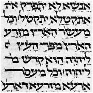
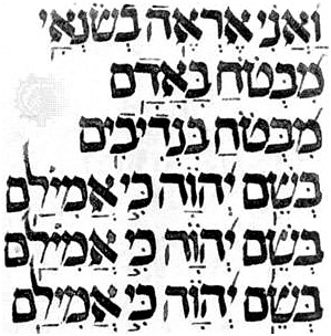
The traditional square Hebrew, or merubbaʿ, pen hand was developed in the centuries preceding the Common Era. This early script may be seen in the famed Dead Sea Scrolls discovered in 1947. These scrolls are associated with a group of dissident Jews who founded a religious commune on the northwestern shore of the Dead Sea about 180 bce . The commune had an extensive library. Pens were the instruments of writing, and, as in earlier Aramaic documents, leather provided the surface. In these documents the lamed form remained visually prominent.
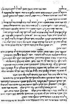
There are no Hebrew manuscripts from the first 500 years of the Common Era. Most of the development in the square Hebrew script occurred between 1000 and 1500 ce . The earliest script to emerge from the Dead Sea writing was the Early Sefardic ( Spharadic), with examples dating between 600 and 1200 ce . The Classic Sefardic hand appears between 1100 and 1600 ce . The Ashkenazic style of Hebrew writing exhibits French and German Gothic overtones of the so-called black-letter styles (see below Latin-alphabet handwriting: The black-letter, or Gothic, style [9th to 15th century]) developed to write western European languages in the late Middle Ages. German black letter, with its double-stroked heads and feet, was difficult for the scribe. Hebrew scripts from this period exhibit some of the same complicated pen stroking and change of pen slant within individual characters. Some decorative qualities of medieval French writing are seen in this Hebrew script.
Spread of Aramaic to the Middle East and Asia
Aramaic was the mother of many languages in the Middle East and Asia. Generally, the Canaanite-Phoenician influence spread west from Palestine, while Aramaic became an international language spreading east, south, and north from the eastern end of the Mediterranean Sea. Never sponsored by great political power, the Aramaic script and language succeeded through inherent efficiency and because the Aramaeans were vigorous traders and extensive travelers in the millennium preceding the Common Era.
One of the important languages to derive from Aramaic was Syriac. It was spoken over large areas to the north and east of Palestine, but the literature emerged from a strong national church of Syria centred in the city of Edessa. The development of Syriac scripts occurred from the 4th to the 7th century ce .
Eastern Christendom was riddled with sects and heretical movements. After 431 the Syriac language and script split into eastern and western branches. The western branch was called Serta and developed into two varieties, Jacobite and Melchite. Vigorous in pen graphics, Serta writing shows that, unlike the early Aramaic and Hebrew scripts, characters are fastened to a bottom horizontal. Modern typefaces used to print Syriac, which has survived as a language, have the same characteristic. Eastern Syriac script was called Nestorian after Nestorius, who led a secession movement from the Orthodox Church of Byzantium that flourished in Persia and spread along trade routes deep into Asia.
Arabic calligraphy
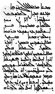
In the 7th and 8th centuries ce the Arab followers of Muhammad conquered territories stretching from the shores of the Atlantic to Sindh (now in Pakistan). Besides spreading the religion of Islam, the conquerers introduced written and spoken Arabic to the regions under their control. The Arabic language was a principal factor in uniting peoples who differed widely in ethnicity, language, and culture. In the early centuries of Islam, Arabic not only was the official language of administration but also was and has remained the language of religion and learning. The Arabic alphabet has been adapted to the Islamic peoples’ vernaculars just as the Latin alphabet has been in the Christian-influenced West.
The Arabic script was evolved probably by the 6th century ce from Nabataean, a dialect of Aramaic current in northern Arabia. The earliest surviving examples of Arabic before Islam are inscriptions on stone.
Arabic is written from right to left and consists of 17 characters, which, with the addition of dots placed above or below certain of them, provide the 28 letters of the Arabic alphabet. Short vowels are not included in the alphabet, being indicated by signs placed above or below the consonant or long vowel that they follow. Certain characters may be joined to their neighbours, others to the preceding one only, and others to the succeeding one only. When coupled to another, the form of the character undergoes certain changes.
These features, as well as the fact that there are no capital forms of letters, give the Arabic script its particular character. A line of Arabic suggests an urgent progress of the characters from right to left. The nice balance between the vertical shafts above and the open curves below the middle register induces a sense of harmony. The peculiarity that certain letters cannot be joined to their neighbours provides articulation. For writing, the Arabic calligrapher employs a reed pen ( qalam) with the working point cut on an angle. This feature produces a thick downstroke and a thin upstroke with an infinity of gradation in between. The line traced by a skilled calligrapher is a true marvel of fluidity and sensitive inflection, communicating the very action of the master’s hand.
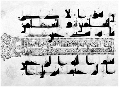
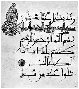
Broadly speaking, there were two distinct scripts in the early centuries of Islam: cursive script and Kūfic script. For everyday purposes a cursive script was employed: typical examples may be seen in the Arabic papyri from Egypt. Rapidly executed, the script does not appear to have been subject to formal and rigorous rules, and not all the surviving examples are the work of professional scribes. Kūfic script, however, seems to have been developed for religious and official purposes. The name means “the script of Kūfah,” an Islamic city founded in Mesopotamia in 638 ce , but the actual connection between the city and the script is not clear. Kūfic is a more or less square and angular script. Professional copyists employed a particular form for reproducing the earliest copies of the Qurʾān that have survived. These are written on parchment and date from the 8th to the 10th century. They are mostly of an oblong as opposed to codex (i.e., manuscript book) format. The writing is frequently large, especially in the early examples, so that there may be as few as three lines to a single page. The script can hardly be described as stiff and angular; rather, the implied pace is majestic and measured.
Kūfic went out of general use about the 11th century, although it continued to be used as a decorative element contrasting with those scripts that superseded it. About 1000 a new script was established and came to be used for copying the Qurʾān. This is the so-called naskhī script, which has remained perhaps the most popular script in the Arab world. It is a cursive script based on certain laws governing the proportions between the letters. The two names associated with its development are Ibn Muqlah and Ibn al-Bawwāb, both of whom lived and worked in Mesopotamia. Of the latter’s work a single authentic example survives, a manuscript of the Qurʾān in the Chester Beatty Library, Dublin.
Distinctive scripts were developed in particular regions. In Spain the maghribī (“western”) script was evolved and became the standard script for Qurʾāns in North Africa. Derived ultimately from Kūfic, it is characterized by the exaggerated extension of horizontal elements and of the final open curves below the middle register.
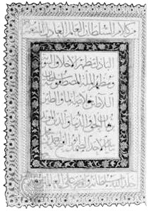
Both Persia and Turkey made important contributions to calligraphy. In these countries the Arabic script was adopted for the vernacular. The Persian scribes invented the taʿlīq script in the 13th century. The term taʿlīq means “suspension” and aptly describes the tendency of each word to drop down from its preceding one. At the close of the same century, a famous calligrapher, Mīr ʿAlī of Tabriz, evolved nastaʿlīq, which, according to its name, is a combination of naskhī and taʿlīq. Like taʿlīq, this is a fluid and elegant script, and both were popularly used for copying Persian literary works.
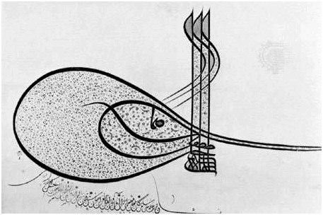
A characteristic script developed in Ottoman Turkey was that used in the chancellery and known as divani. This script is highly mannered and rather difficult to read. Peculiar to Turkish calligraphy is the tuğra (ṭughrā), a kind of royal cipher based on the names and titles of the reigning sultan and worked into a very intricate and beautiful design. A distinctive tuğra was created for each sultan and affixed to imperial decrees by a skilled calligrapher, the neshanı.
There has always existed in the Islamic world a keen appreciation of fine handwriting, and, from the 16th century, it became a practice to assemble in albums specimens of penmanship. Many of these assembled in Turkey, Persia, and India are preserved in museums and libraries. Calligraphy, too, has given rise to quite a considerable literature such as manuals for professional scribes employed in chancelleries.
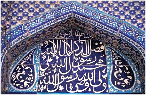
In its broadest sense, calligraphy also includes the Arabic scripts employed in materials other than parchment, papyrus, and paper. In religious buildings, verses from the Qurʾān were inscribed on the walls for the edification of the faithful, whether carved in stone or stucco or executed in faience tiles. Religious invocations, dedications, and benedictory phrases were also introduced into the decoration of portable objects. Generally speaking, there is a close relationship between these and the scripts properly used on the conventional writing materials. It was often the practice for a skilled penman to design monumental inscriptions.
Indic calligraphy
The most important examples of calligraphy to develop from Aramaic writing in its dissemination through South and Central Asia were the scripts of India, especially of Sanskrit. Indic writing first appeared in the 3rd century bce during the reign of Ashoka (c. 265–238 bce ). The leader of a great empire, Ashoka turned from military success to embrace the arts and religion. Ashoka’s edicts were committed to stone. These inscriptions are stiff and angular in form. Following the Ashoka style of Indic writing, two new calligraphic types appear: Kharoshti and Brahmi. Kharoshti was used in the northwestern regions of India from the 3rd century bce to the 4th century ce , and it was used in Central Asia until the 8th century. It is characterized by a vigorous pen letter, reflecting the influence of Middle Eastern calligraphy.
Copper was a favoured material for Indic inscriptions. In the north of India, birch bark was used as a writing surface as early as the 2nd century ce . Many Indic manuscripts were written on palm leaves, even after the Indian languages were put on paper in the 13th century. Both sides of the leaves were used for writing. Long rectangular strips were gathered on top of one another, holes were drilled through all the leaves, and the book was held together by string. Books of this manufacture were common to Southeast Asia. The palm leaf was an excellent surface for pen writing, making possible the delicate lettering used in many of the scripts of southern Asia.
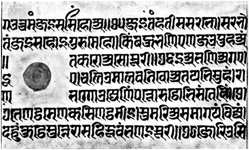
Visually, Sanskrit is associated most closely with the alphabetic form named Devanagari. In a 15th-century pen-written manuscript in the Freer Gallery at Washington, D.C., it can be observed that the pen’s nib is cut wide, giving a considerable difference in thick and thin strokes. The alphabetic signs hang down from a strong horizontal top line that may become connected. Through the years the strong horizontal and vertical emphasis of inscription writing has been preserved in the Devanagari script, and modern typefaces and teaching manuals stress this stiffness of execution. In informal documents this historical script can have more warmth and grace.
Greek handwriting
Origins to the 8th century ce
The oldest Greek writing, syllabic signs scratched with a stylus on sun-dried clay, is that of the Linear B tablets found in Knossos, Pylos, and Mycenae (1400–1200 bce ). Alphabetic writing, in use before the end of the 8th century bce , is first found in a scratched inscription on a jug awarded as a prize in Athens. The consensus is that the Homeric poems were written down not later than this time; certainly from the time of the first known lyric poet of ancient Greece, Archilochus (7th century bce ), individuals committed their works to writing. But the vehicles of literary writing have perished. Scratchings on pottery or metal and then texts deliberately cut in bronze or marble or painted on vases are, until about 350 bce , the only immediate evidence for the way the Greeks wrote, and their study is normally treated as the province of epigraphy.
A find in 1962 at Dervéni (Dhervénion), in Macedonia, of a carbonized roll of papyrus (Archaeological Museum, Thessaloníki, Greece) offers the oldest example of Greek handwriting and the only one preserved in the Greek peninsula (end of the 4th century bce ). From then until the 4th century ce , there are countless texts, especially on papyrus. Found in Egypt and, with a few exceptions, written there, these texts have given a firm foundation for knowledge about the handwriting of the era. From outside Egypt there is a Greek library buried in Herculaneum, 79 ce ; and papyri and parchments from Owrāmān, Kurdistan, 1st century bce ; from Dura-Europus on the Euphrates, 3rd century bce to 3rd century ce ; from Nessana, 6th century ce ; and from the Dead Sea area (Qumrān, 1st centuries bce and ce ; Murabbaʿat and ʿEn Gedi, 2nd century ce ). A number of original vellum manuscripts have survived from the 4th century ce onward, preserved in libraries such as at the monastery of Saint Catherine at Mount Sinai. These materials of diverse origin suggest that the forms and shape of Greek handwriting were remarkably constant throughout the Greek world, wherever writing was practiced and whatever material was used; within this consistent framework it is occasionally possible to distinguish local variations (as between the contract hands of 1st-century- ce Dura and of Egypt).
The principal vehicles for writing were wax tablets incised with a stylus or a prepared surface of skin, such as leather and vellum, or of papyrus written on with a pen. Other surfaces—e.g., broken pieces of pottery, lead, wood, and even cloth—were also used. To some extent the forms of letters were affected by the resistance of the material to the writing instrument. It is likely that the use as a pen of a hard reed, split at the tip and cut into a nib (which had to be constantly sharpened), is an invention of the Greeks. Egyptian scribes used a soft reed, with which ink was brushed on.
Until about 300 ce , ink was usually made of a fine carbon powder such as lampblack, mixed with gum arabic and water, which even today retains its black lustre. Carbon inks were then replaced by iron-gall inks made from a mixture of tannic acid (made from oak galls soaked in water), ferrous sulphate, and gum arabic. There seem to have been several reasons for the changeover to iron-gall inks: they were easier and more economical to make, they could be made in quantity, and they did not flake off the surface of vellum (which was becoming the preferred writing surface of the time) as carbon inks did. Iron-gall ink does have certain drawbacks: it has a tendency to fade and oxidize over time, turning from a dark grayish-black when freshly written to a characteristic brown (which today is often associated with early manuscripts), and it sometimes has a corrosive effect on vellum, causing the writing from one side of a page to bleed through to the other. On paper, some iron-gall inks have actually eaten through the writing surface. Erasures, which could be made on wax with the blunt end of a stylus and on papyrus by wiping with a wet sponge, were more difficult on vellum written with iron-gall inks. Corrections were made by scraping the faulty text off with the edge of a knife, rubbing the surface with an abrasive, and then burnishing it to make it smooth enough to receive ink again. Sometimes when vellum was not easily available or was relatively expensive, an outdated text might be erased and written over. Since the ink actually dyes the vellum, traces of the original text often remain and appear faintly under newly written text. Such doubly written manuscripts are called palimpsests.
Papyrus was normally sold in rolls (volumina) made up of 20 to 50 or more sheets. These sheets were made by laying freshly cut strips from the papyrus plant (Cyperus papyrus or Papyrus antiquorum) side by side in one direction with another layer of strips crossing them at right angles. Sometimes a third layer was added parallel to the first. This “sandwich” was then moistened with water and pressed together until dry, forming a sheet. The layer containing the horizontal fibres was placed on the inside of the roll, on which side (the recto) each attached sheet overlapped the next when the roll was held horizontally. Leather, similarly, was used for making rolls (e.g., the Dead Sea Scrolls). With the advent of the Christian Era, the custom of folding sheets of papyrus or vellum down the middle and stitching the gatherings of two or four sheets along this fold into a cover gave rise to a book of modern form—the codex (a word that originally referred to a set of wax tablets coupled with a leather thong).
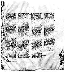
The early Christians deliberately chose the commercial vellum notebook (membranae) in which to circulate the Christian Gospels in preference to the traditional Jewish roll. Almost without exception the earliest texts of the New Testament are in codex form, even though written on papyrus, which is less able than vellum to bear repeated bending. In the 2nd century ce , pagan works of literature also appeared in this format. By the 4th century it became the predominant form, and codices with handsome margins, of dazzling white vellum, and of sufficient size to contain the whole Bible (e.g., the Codex Sinaiticus) were being produced.
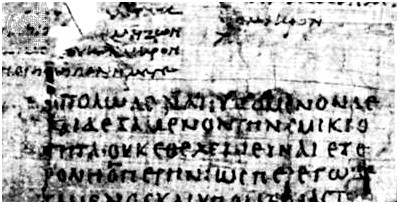
The fundamental distinction in types of handwriting is that between book hands and documentary hands. The former, used especially for the copying of literature, aimed at clarity, regularity, and impersonality and often made an effect of beauty by their deliberate stylization. Usually they were the work of professionals. Outstanding calligraphy is not common among papyrus finds, perhaps because they are mainly provincial work. But the British Museum Bacchylides (discussed further under “The Roman period,” see below) or the Bodleian Library Homer can stand comparison with any later vellum manuscript from outside Egypt. Book texts are written in separately made capitals (often called uncials, but in Greek paleography, except for the time-hallowed class of biblical uncials, the term is better avoided) in columns of writing, with ample spaces between columns and good margins at head and foot. Punctuation (usually by high dot, a point next to the top of the last letter of a section) is minimal or completely absent; accents are inserted only in difficult poetic texts or as practice by children; and letters are not grouped into separate words.
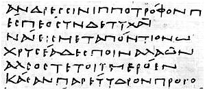
Documentary hands show a considerable range: stylized official “chancery” hands, the workaday writing of government clerks or of the street scribes who drew up wills or wrote letters to order, the idiosyncratic or nearly illiterate writing of private individuals. The scribe’s aim was to write quickly, lifting the pen very little and consequently often combining several letters in a continuous stroke (a ligature); from the running action of the pen, this writing is often termed cursive. Scribes also made frequent use of abbreviations. When the scribe was skillful in reconciling clarity and speed, such writing may have much character, even beauty; but it often degenerates into a formless, sometimes indecipherable, scrawl.
Both types of hand, in spite of the different styles they assume at different periods, show remarkable uniformity and continuity in the shapes of letters. Behind both lies an unvarying basic alphabetic form taught in the schools. The more skillful a book-hand scribe was, the harder it is to date the scribe’s work. Documents in the ancient world carried a precise date; books never did. To assign dates to the latter, paleographers take account of their content, the archaeological context of their discovery, and technical points of book construction (e.g., quires, rulings) or modes of abbreviation. But they find of great service: (1) a stylistic comparison with those dated documentary hands that show resemblances to book hands, and (2) those cases where a roll was reused—i.e., has a literary text on its recto and a dated document on its verso (in which case there is an estimate for the literary text, generally no more than 50 years before the date of the verso) or has a dated document on the recto and a book hand on the verso (which gives a possible date for the literary text of not more than 25 years after the document). The number of illustrated manuscripts of this period is small; their quality is varied; and there is no agreement among specialists about the sources from which illustrations were taken.
Any historical sketch is bound to be a simplification. At certain epochs several different styles of handwriting existed simultaneously, so that there is no straight line of development. Moreover, owing to the arbitrariness of finds, generalizations are based mainly on provincial work; and, even in that, examples of book hand belonging to the 2nd century bce and the 5th century ce are still relatively rare.
Ptolemaic period
In the roll from Dervéni, Macedonia, dated on archaeological grounds to the 4th century bce , lines and letters are well spaced and the letters carefully made in an epigraphic, or inscription, style, especially the square E, four-barred Σ, and arched Ω; the whole layout gives the effect of an inscription. In the Timotheus roll in Berlin (dated 350–330 bce ) or in the curse of Artemisia in Vienna (4th century bce ), the writing is cruder, and ω is in transition to what is afterward its invariable written form. Similar features can be seen in the earliest precisely dated document, a marriage contract of 311 bce . It has been argued that a documentary hand of cursive type had not yet been developed and that it was a creation of the Alexandrian library. Plato, however (Laws 810), speaks of Athenian writing whose aim was speed; later on, when a cursive hand had certainly been developed, documentary scribes often used separate capitals.
Characteristic of its period is the contrast of size between the long letters (e.g., ) and narrow letters . And characteristic forms are to be seen in the letters (with its long crossbar, often with initial stroke); (upsilon) with long shallow bowl; or in three or four strokes; in three strokes; (alpha) raised off the line and its last vertical not finished; small round (with internal dot or tiny stroke); and broad epigraphic and . In documentary cursive hands of this period, letters seem to hang from an upper line: (alpha) often turns into a mere wedge, and (nu) lifts its second vertical above the line.
In the 2nd century bce the contrast between long letters and narrow letters disappears, the writing grows rounder, and letters are often linked by ligatures at the top of their last vertical (e.g., ). In a loan contract of 99 bce (The John Rylands University Library of Manchester), in which capitals and cursive are mixed, this irregular roundness is clearly seen. Note the ε with detached crossbar and the exaggerated serifs which have been elevated by some paleographers into a criterion of a special style, though in fact they are always apt to occur.
Roman period
Half a century or so passed after 30 bce before a definitely Roman manner was established. In documentary hands the tendency to roundness continued. Documentary cursive may be influenced in various ways (e.g., by Latin forms such as those of e and d, or by the exaggeration of verticals practiced by chancery scribes); the script may lean over in either direction, or it may be reduced to tiny proportions. In the 2nd century the cursive hand tended to be round and sprawling, in the 3rd century to become more angular, and in the 4th century to become characterless and to combine letters into ligatures that distorted the forms of the letters concerned. The book hand of a manuscript of Plato’s Phaedo (c. 100 ce ; Egypt Exploration Society, London) shares the informality of cursive but regularizes the letter forms. Written on a larger scale and with more formality, this round hand can be very beautiful. In an example found at Hawara (2nd century ce ), almost every letter (even ρ, τ, ι) would go into an identical square; only ϕ and ψ cross it above and below, μ, ω, and π horizontally.
If this writing is made to lean to the right and to revive the 3rd-century- bce distinction between narrow and broad letters, it takes on the aspect of the “severe” style of the Bacchylides roll in the British Museum (2nd century ce ). If, however, the scribe makes the verticals or obliques thicker and his horizontals thinner, the hand is called biblical uncial, so named because this type is used in the three great early vellum codices of the Bible: Codex Vaticanus and Codex Sinaiticus of the 4th century and Codex Alexandrinus of the 5th century. It is now certain that this style goes back to the 2nd century ce . Heavy decoration is also a feature of the Coptic style, of which there are examples as early as the 2nd century ce . This hand may be thought of as constituting a special case of biblical uncial.
Byzantine period
For the paleographer the significant division is not the founding of Constantinople (now Istanbul, Turkey) in 330 but the 5th century, from which a few firmly dated texts survive. At its close a large, exuberant, florid cursive was fully established for documents; in the 7th and 8th centuries it sloped to the right, became congested, and adopted some forms that anticipated the minuscule hand. A favourite informal type of the 6th century is shown in an acrostic poem by Dioscorus of Aphrodito; it bears a clear relationship to the Menander Dyskolos hand, which was probably written in the later 3rd century ce . Similar pairs could be found to illustrate the continuity in transformation of the biblical uncial and Coptic styles. The latest Greek papyrus from Egypt is not later than the 8th century. There was a considerable lapse of time before the history of Greek writing resumed at Byzantium.
The 8th to 16th century
To judge when and where a Greek manuscript was written is as difficult for this as for the earlier period, but for different reasons. The material for study is admittedly more extensive; manuscripts produced in the Middle Ages and Renaissance have been preserved in very large numbers (more than 50,000 whole volumes survive, of which probably 4,000 or 5,000 are explicitly dated), and they include work from most parts of the Byzantine Empire as well as from Italy. The difficulty of the paleographer lies in the essential homogeneity of the material, which is largely the result of the conditions in which the manuscripts were produced.
The fully developed Byzantine Empire of the 8th to the mid-15th centuries was extraordinarily uniform in its culture. Its contraction in space after the Arab conquests of the 7th century, which cut off the more distant and ethnically differentiated provinces of Syria, Palestine, and Egypt, made it a relatively compact geographical entity. The continuity and comparative stability of a single empire not divided into distinct national states such as evolved in the West resulted in a strength and unity of tradition of which the Byzantines were always conscious and that shows in their habits of writing no less than in their literature and art. Distinct local styles and sharp breaks in ways of writing in different periods cannot, therefore, be looked for; characteristics that may be especially typical of one period emerge gradually and disappear equally slowly. A more potent factor than date or place in producing divergences in the style of writing is the purpose for which a manuscript was designed and what type of scribe wrote it.
Late uncial, 9th to 12th century
There is a gap in the evidence covering the 7th and 8th centuries, because of the Arab conquest of Egypt, the perpetual wars on all fronts in the 7th century, and the iconoclastic struggle among Eastern Christians during the 8th and early 9th centuries, so that no literary texts (and very few others) have survived that can actually be dated to this period.
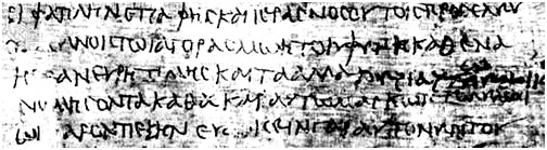
During this time the evolution of writing in capitals (a style called uncial) probably continued toward a greater formality and artificiality. But this natural tendency was hastened by the introduction and spread of minuscule as the normal way of writing, after which the purpose of uncial changed completely. From an everyday hand in which all books were naturally written, it became a ceremonial hand used only for special copies and therefore grew increasingly stylized and artificial. In the 9th century a still elegant style was used for both patristic and classical works in splendid volumes destined for the imperial library or for presentation copies, such as the copy of Gregory of Nazianzus (Bibliothèque Nationale, Paris) made for the emperor Basil I between 879 and 883. By the 11th and 12th centuries, capitals were used only for liturgical books, mainly lectionaries, which had to be read in dimly lit churches; but the increasing tortuousness of the style must in the end have reduced its usefulness, and by about 1200 uncial was dead.
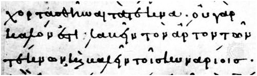
Earliest minuscule, 8th to 10th century
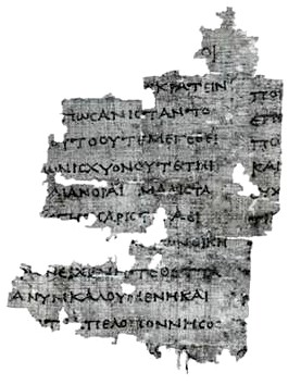
By far the most important development that took place during the 7th–8th-century gap was the introduction of minuscule. There is no incontrovertible evidence of how this came about, or where. What scraps of evidence there are (a few documents from the gap, a few sentences in lives of the abbots of Stoudion of that time, and the first dated manuscript written in true minuscule) point to its development from a certain type of documentary hand used in the 8th century and to the likelihood that the monastery of the Stoudion in Constantinople had a leading part in its early development. Though its origins are obscure, the reasons that led to its introduction and rapid spread are obvious: the state of poverty resulting from wars and persecutions coincided with a shortage of papyrus after the Arab conquest of Egypt in the middle of the 7th century, and these factors combined to induce a search for a more economical use of the relatively expensive vellum; the polemics of the iconoclastic controversy demanded a speedy, informal style of writing; and, finally, when peace was restored in the middle of the 9th century, the revival of learning, with the reorganization of the university, brought the need for multiplying plain workmanlike texts for scholarly purposes.
The earliest dated example of true minuscule (and it is probably one of the oldest extant examples altogether) is a Gospel written in 835 (Porfiry Gospel; National Library of Russia, St. Petersburg), probably in the monastery of the Stoudion. Here are found all the characteristics of the earliest minuscule, which is called pure minuscule because there is as yet no admixture of uncial forms, except occasionally at line ends. The letters are even and of a uniform size; letters are joined or not joined to each other according to strict rules, sometimes by ligatures in which part of each letter is merged in the other, but not to the extent of distorting the shape of either letter. There is no division between words, for the divisions are only those that arise from the rules for joining or otherwise of individual letters, and at this stage any letter that can be joined to the next one nearly always is joined to it. Breathings, which affect pronunciation, are square, either or , and accents are small and neat; abbreviations are very few, usually confined to the established contractions for nomina sacra (the names and descriptions of the Trinity and certain derivatives), omitted ν at line ends, a few of the conventional signs for omitted case endings, and sometimes a ligature for και (“and”). The writing stands on the ruled lines or is guided by them.
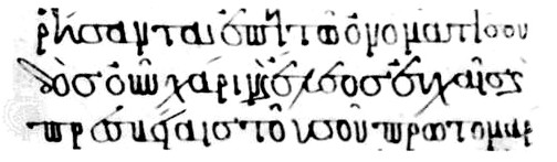
Absolutely pure minuscule did not last long. Gradually, uncial forms of those letters that had specifically minuscule forms began to be used alongside the minuscule forms: λ was the first to appear, followed by ξ and then κ, all by the end of the 9th century. Then from about 900 onward, γ, ζ, ν, π, and σ were used regularly, while α, δ, ε, and η were used sometimes. Not before about 950 were β, μ, υ, ψ, and ω used, and still comparatively rarely. But by the end of the 10th century, the interchangeability of all uncial and minuscule forms was complete, though all the alternative forms are not necessarily found in any one manuscript. Perhaps the earliest dated manuscript with any uncial form in it is of 892/893 (Mount Sinai, Saint Catherine, MS. 375 + St. Petersburg, Bibl. Publ. MS. 343, Chrysostom), but pure minuscule continued to be used, in probably the majority of manuscripts, up to 900 and thereafter mainly in provincial manuscripts until the last dated example in 969 (Metéora, Metamorph. MS. 565, John Climacus). Besides the intrusion of uncial letters, some other characteristics of the earliest minuscule were modified during the 10th century. Rounded breathings, symbolized by the marks ‘ and ’, are first found in manuscripts of the last half of the century, interspersed with square ones. From about 925 the practice of making the writing hang from the ruled lines began to prevail. Although in most manuscripts abbreviations were confined to a few forms used at line ends only, a few copies dated in the last part of the century used nearly all the conventional signs.
In spite of these developments—the gradual disappearance of pure minuscule and the other changes that accompanied it—the same general styles of writing persisted until about the end of the 10th century. Broadly considered, three styles can be distinguished during this period. There is a rather primitive-looking, angular, cramped style that may perhaps be associated with the Stoudion monastery, in which a certain number of mainly patristic texts were written c. 880–c. 980. Second, there is a plain, neat, workmanlike style (seen in a commentary on Gregory of Nazianzus copied in 986 that is preserved in the Bibliothèque Nationale at Paris), which continued in use at least until the end of the 10th century. In it were written several of the important manuscripts that are now the oldest texts of some ancient Greek authors (for example, Aeschylus, Sophocles, and Aristophanes) but are unfortunately not explicitly dated. Third, a consciously elegant, even mannered, style was used in books produced for the imperial library or for wealthy dignitaries, but it is not found before the early years of the 10th century. All of these styles, which have numerous variations and are by no means always distinct from one another, are found at least until the end of the 10th century. Their one common characteristic is a crispness and individuality that clearly distinguishes them from writing of the next period.
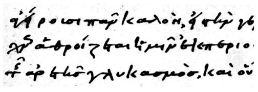
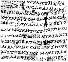
Formal minuscule, 10th to 14th century
From about the middle of the 10th century, a smoother, almost mechanical appearance can be noticed in an increasing number of manuscripts; the hands seem more stereotyped, less individual. They are not immediately distinguishable from the plainer styles of the earlier part of the century, and their evolution during the next four centuries was very gradual. A few distinct types can be singled out from time to time. A bold, round, heavy liturgical style, fully established in the 11th century, was one of the most enduring types; it became more and more stereotyped and mechanical until, in the 15th century, a branch of it was transplanted to Italy.
The style most widely used for biblical and patristic texts from the end of the 10th century, probably mainly in monastic houses in Constantinople, was one with plain, neat, rounded letters; this style became known as Perlschrift from its likeness to small, round beads strung together. A very plain, businesslike, rather staccato style was used in manuscripts with musical notation, most commonly in the 12th and 13th centuries.
Manuscripts written outside Constantinople are recognizable, if at all, usually by a rougher, provincial appearance. Only two styles can be assigned with any certainty to a specific provincial centre. One, a small unpretentious hand used by Saint Nilus of Rossano, the founder of numerous monasteries in southern Italy at the end of the 9th century, was used for a time by others in that area. In the heyday of the reorganized Greek monasteries there in the 12th century, another elegant, rather mannered style, which almost certainly had its origin in Constantinople, is nevertheless found in manuscripts known to have been written in southern Italy and Sicily.
These particular styles, however, are not really as typical of the period as the less distinctive plain hands in which the majority of the manuscripts are written, at least in the 11th and 12th centuries.
The comparatively uniform type of writing of which all these were minor variations was remarkably enduring and widely dispersed, but, from the 11th century onward, certain changes may be observed that help to date manuscripts written in all types of formal minuscule. One change in its general appearance may be noticed as the 12th century advanced: an increasing lightness of touch and a lessening of the closely knit, rather thick appearance that is characteristic of the 11th century. But the most noticeable change in this period is the breakdown in the evenness and regularity of the writing, which is partly attributable to the influence of documentary and the later personal hands. It is not, however, entirely so attributable, for a tendency to enlarge some letters out of proportion to the size of the rest is seen in a small way in some of the more personal hands of the earliest period. But it is rare in formally written manuscripts, only gradually becoming more general until, in the 12th and 13th centuries, it is the most noticeable feature of even the most formal hands. In the 14th century and later there was a return to less flamboyant ways with the tendency to imitate earlier models more closely, but the habit of enlarging some and diminishing the size of other letters never died out.
In the actual forms of letters used in these formal styles, there was practically no change; very occasionally, from the end of the 10th century onward, one of the “modern” forms of letter normally confined to personal hands found its way into a formal manuscript. Much the same is true of ligatures. The tendency from the 11th century onward was to use ligatures and to join letters less automatically than in earlier times. The permissive rules and most of the forms remained unchanged, for, already in the 10th century, most of the distorting forms (notably those in which the ε is represented only by a C-shaped stroke; e.g., for σε) were well established, and in formal manuscripts these, with the earlier forms, continued in use until they were illogically taken over by the first printers of Greek. Time did, however, gradually increase the tendency to join letters by insetting them in or superimposing them upon each other. Abbreviations were even more conservatively used, only the oldest conventional forms being admitted, and often only a very few and those only at line ends.
The rule that the writing should hang from the ruled lines, already applied in most manuscripts by the mid-10th century, became invariable by the middle of the 11th. Square breathings (used indiscriminately among the round ones) were gradually eliminated, though they did not completely disappear from formal manuscripts until the middle of the 12th century. The practice of joining accents with breathings and also with the letters to which they belonged spread from personal hands to formal writing in the 13th century, but it was far more often avoided altogether.
Apart from the actual writing, one development is common to all manuscripts written in this period: the use of paper instead of vellum, which occurred first perhaps in the late 11th century and was common by the 13th century whenever economy was a major consideration.
These are the main criteria by which a formally written manuscript can be assigned to an earlier or a later part of this period. But the problem of distinguishing different styles and their dates, and their places of origin, remains most difficult for these Greek manuscripts.
Personal hands, 12th to 14th century
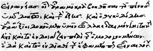
From the beginning of minuscule, there were obviously educated individuals who occasionally copied texts for their own use in a formal hand that nevertheless had a distinctive personal flavour; indeed, professional scribes occasionally used a less formal style than usual. Several dated examples of this type of hand survive from the 10th, 11th, and early 12th centuries, but they are rarities. Toward the end of the 12th century, however, the prosperity and comparative stability of the Comnenan age (named from the dynasty of Byzantine emperors bearing the name Comnenus), with its brilliant literary and artistic achievements, gave way to increasing internal chaos and the hostile encirclement of Byzantium that was a prelude to the Fourth Crusade and the sack of Constantinople by the Western powers in 1204. Scholars perhaps already felt the pinch of poverty, which naturally grew greater during the exile of the Byzantine court (1204–61) and culminated in the economic crises of the 14th century.
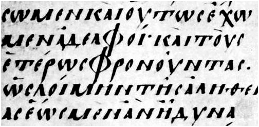
Certainly, a change in writing habits began slowly to take place. Instead of commissioning professional scribes to copy manuscripts, some scholars began to make copies for themselves, and, in place of the smooth, mechanical styles of the professionals, they used the sort of writing that they presumably already used for personal notes. This was an adaptation (for greater clarity) of the type of writing that had been standardized in official documents from the beginning of the Byzantine period. Its chief characteristic was the greatly exaggerated size of certain letters or parts of letters, particularly letters with rounded bows such as β, ε, ζ, θ, κ, ξ, ο, υ, ϕ, and ω, and the excessive size of these letters is made to look even more unbalanced by some exceptionally small forms of, for example, η, ι, ν, or ρ. This essentially unbalanced, “wild” look was transplanted to literary manuscripts written by scholars for their own use.
Along with this exaggerated contrast in size between letters, they took from the documentary hands several new forms of letters that had gradually evolved from the originally common forms of both hands. In the 12th century the new scholarly hands began to use with separate small bows; , with a broken back; , which had lost its high first stroke; and , which had dropped its first long downstroke; and, by the end of the 13th century, , with a short embryonic tail. The old forms of ligature were kept basically the same but in some cases were reduced to a barely recognizable minimum (e.g., or for ει) and in others were distorted by the general flourishing tendency of the script (e.g., for επ). Abbreviations were naturally used with great frequency in all positions; the ancient conventional signs for suppressed syllables, which had acquired rounded and more flourished shapes, were used alongside a certain amount of “arbitrary” abbreviation in which a large part of a word was omitted and replaced simply by a general sign that some abbreviation had taken place.
Accents and breathings joined with each other, with letters, and with abbreviation marks are found earlier and more frequently in scholarly than in formal manuscripts. The only exception to the rule of round breathings in this type of manuscript is in cases of deliberate archaism such as practiced by Demetrius Triclinius.
One of the earliest datable examples of these scholarly productions is the copy of his commentary on Homer’s Odyssey (Biblioteca Nazionale Marciana, Venice) written c. 1150–70 by Eustathius, the scholar-archbishop of Thessalonica. In the 13th century the exaggeration of especially round features reached its height, while in the 14th century the tendency, as in the formal styles of writing, was toward less ebullience and exaggeration, and the writing of scholars such as Triclinius is compact and sober. For these hands the problem is not to discover centres of writing or styles for different uses but to identify the hands of individual scholars.
The Italian Renaissance
Before long, Greek scribes began to go to Italy, and both scholars and scribes arrived in increasing numbers as the Turks pressed in around the Byzantine capital until it finally fell in 1453. They brought with them, naturally, the two styles of writing that had persisted throughout the history of the empire. On the one hand, professional scribes such as Joannes Rhosus (died c. 1500), the majority of them from Crete, copied an astonishing number of manuscripts in the formal—and by this time glib and stereotyped—“liturgical” style of writing. On the other hand, scholars such as John (Janus) Lascaris continued to write in a mannered personal style (e.g., a letter of Demetrius Chalcondyles of 1488 in the Biblioteca Apostolica Vaticana, Vatican City).
It was on the scholarly hands that Aldus Manutius and other early Italian printers of Greek based their types. But perhaps the most enduring was that of a group of Cretan scribes who were employed by the French king Francis I in his library at Fontainebleau. The writing of one in particular, Angelus Vergecius, was used as a model for the French Royal Greek type, which has influenced the form of Greek printing down to the present day.
Source: www.britannica.com